Since Flow loves nothing better than a creative challenge, being asked to come up with a fresh brand identity for an organisation is akin to giving an artist a blank canvas and loaded palette.
Sometimes the brief is a little different. Given that its unique branding is what separates a business from competitors in the marketplace, an ageing brand inevitably responds well to a complete refresh.
Over more than a decade we have designed some innovative logos, created corporate identities, branded company collateral and injected new life into dated brands. Whether it’s a caravan, cupcake or crime bureau that needs a new face, Flow’s got you covered.
Here are a few examples of work in progress and final products that demonstrate our branding smarts:
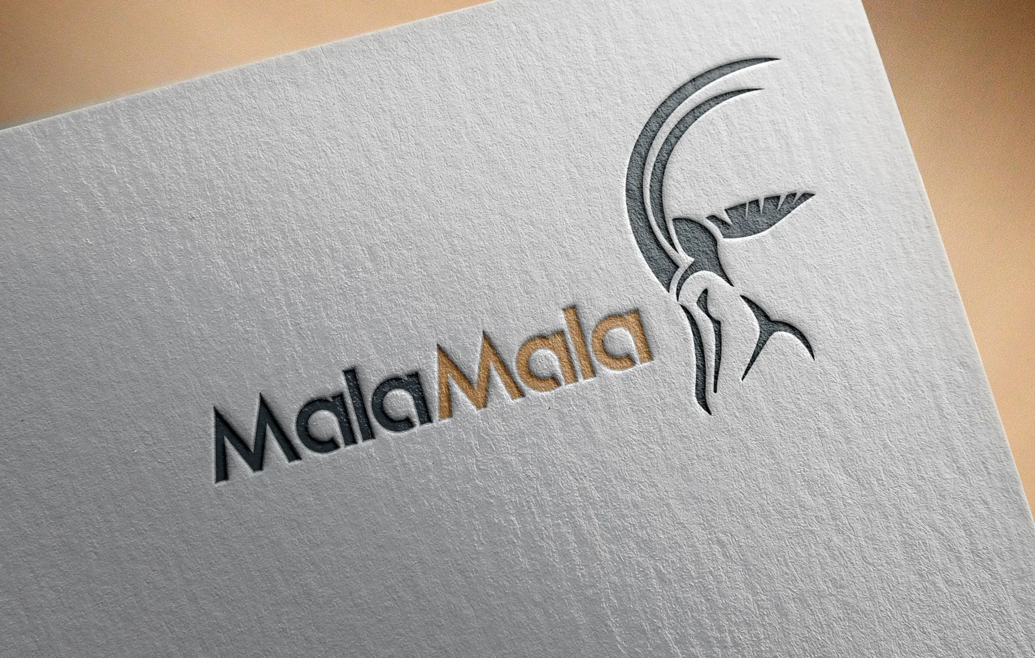
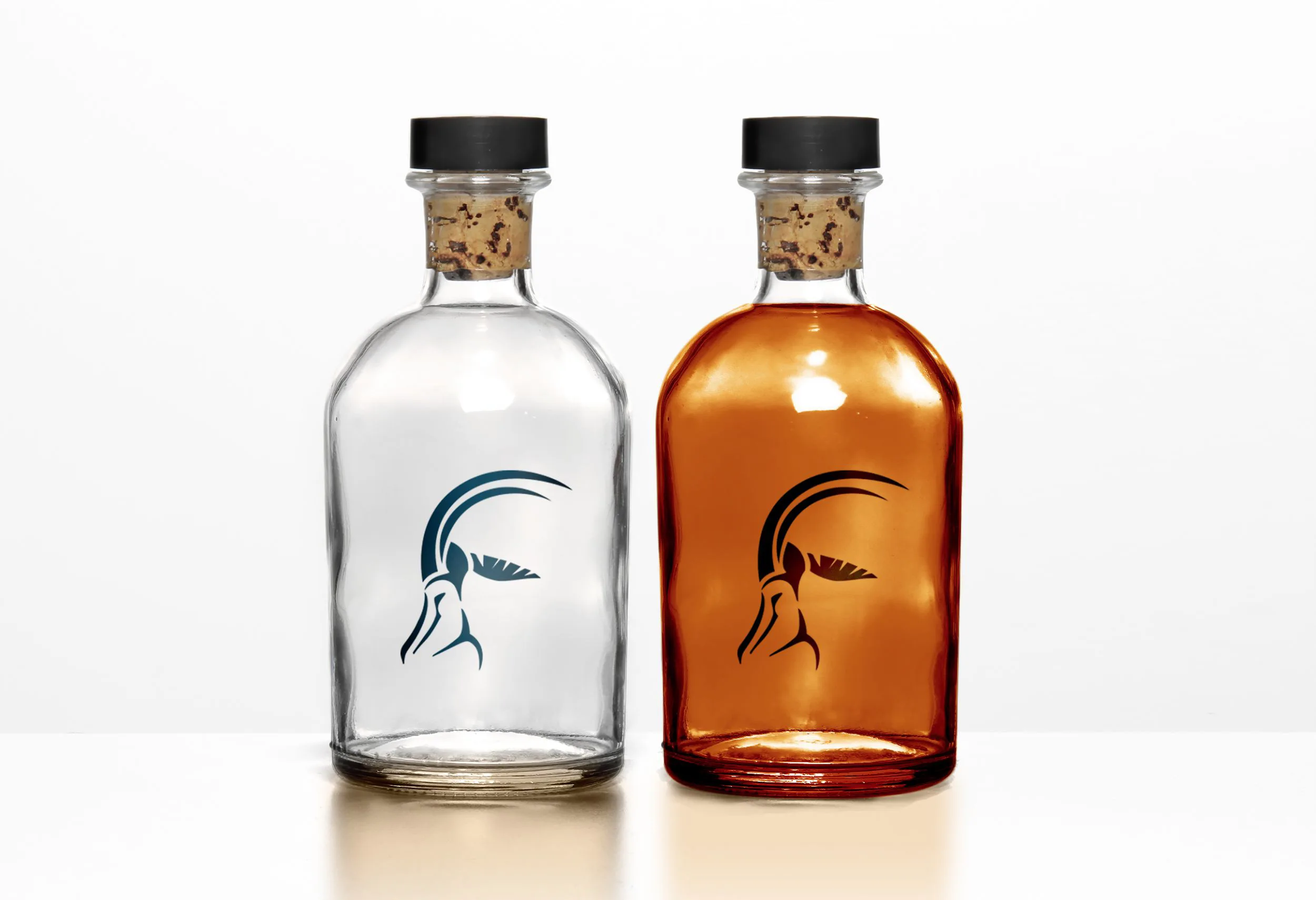
MalaMala
MalaMala is a brand that has remained unchanged for decades, but given that the game lodge was upgrading its lodges and operating in a more competitive landscape, the time was right for a brand refresh.
Flow’s brand workshop focused on the concept of a new identity versus the inherent value attached to the old logo. It was ultimately agreed that the MalaMala brand needed to be more relevant and current, so we developed a new identity and associated collateral, including signage, vehicle livery, website, kids’ activity books, business cards and presentation templates.
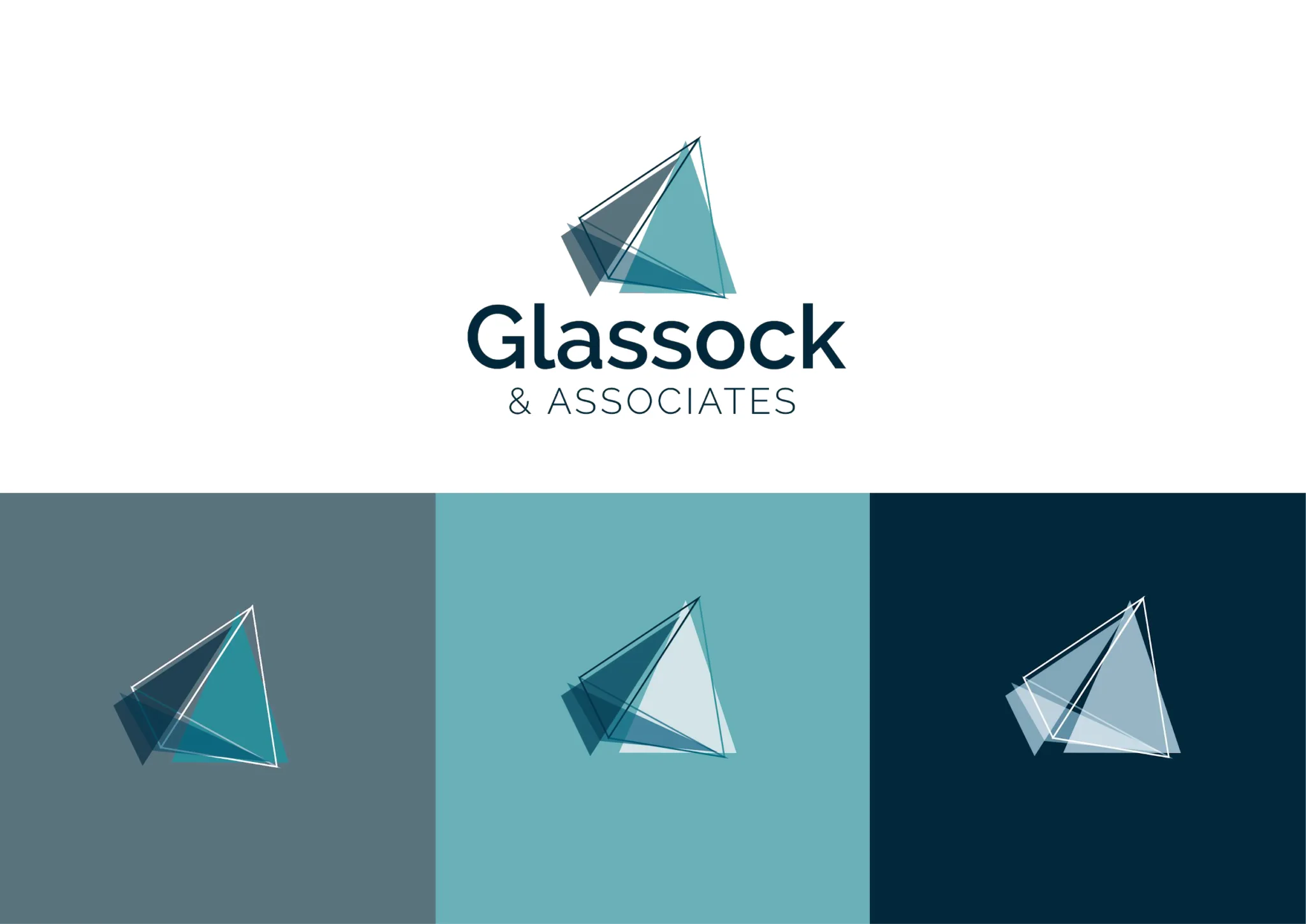
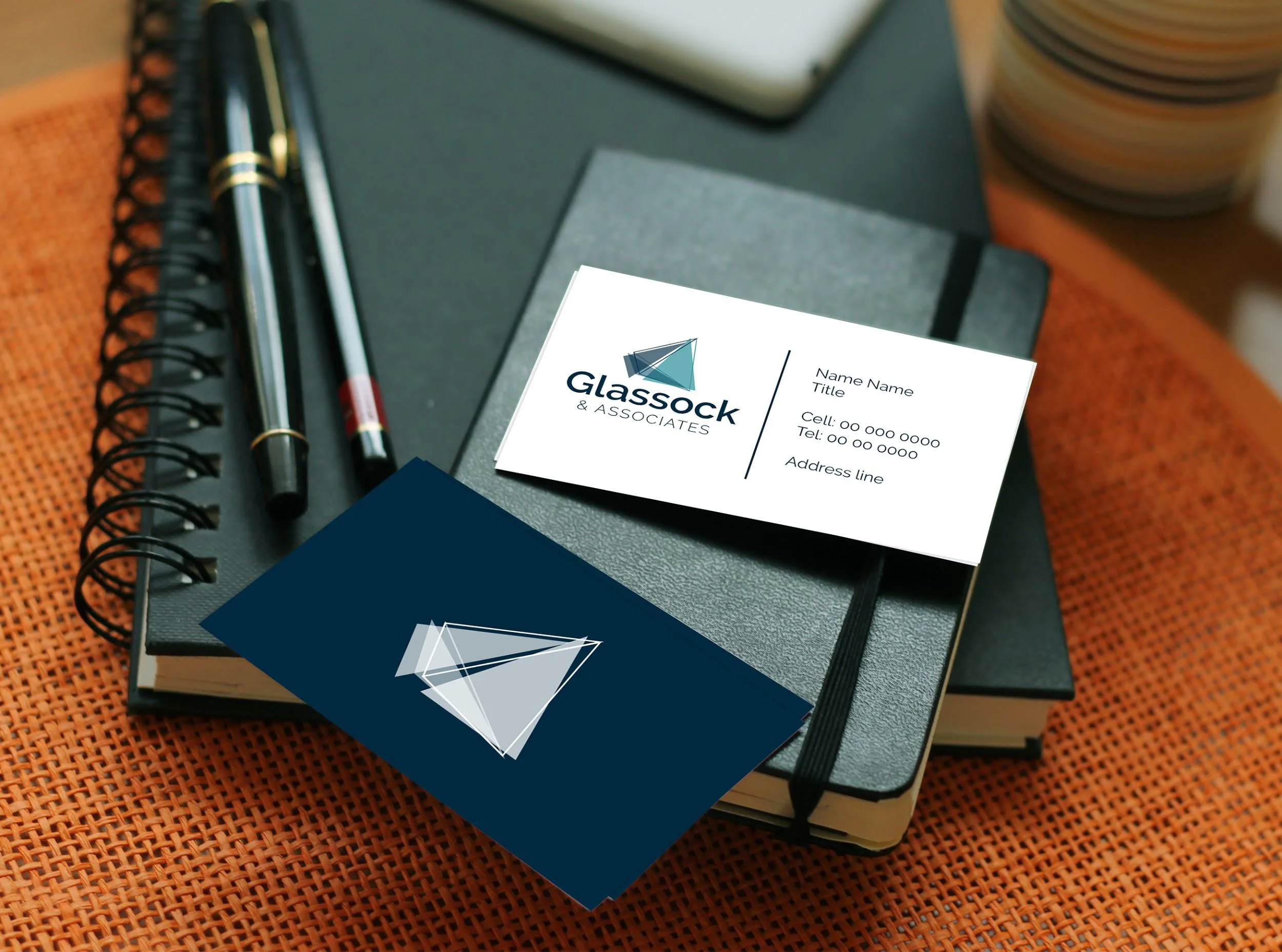
Glassock
Glassock provides corporate and individual employee benefits and financial-planning solutions. It tasked us with refreshing its company logo to reflect its new scope of business and to develop a corporate identity that could be applied to all collateral.
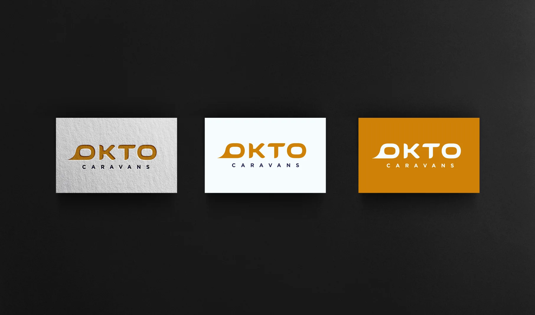
OKTO caravans
A new caravan company, a serious brainstorming session and voilà – a new logo!

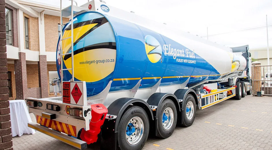
Elegant Fuel
Since Flow was already managing the Elegant Fuel website and providing PR services to the fuel provider, creating artwork formed an extension of existing service provision.
Our designers adapted the client’s current corporate identity to create some seriously large artwork that could be used to brand its fuel tankers.
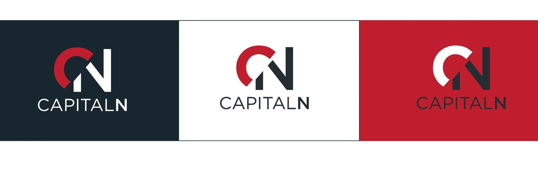
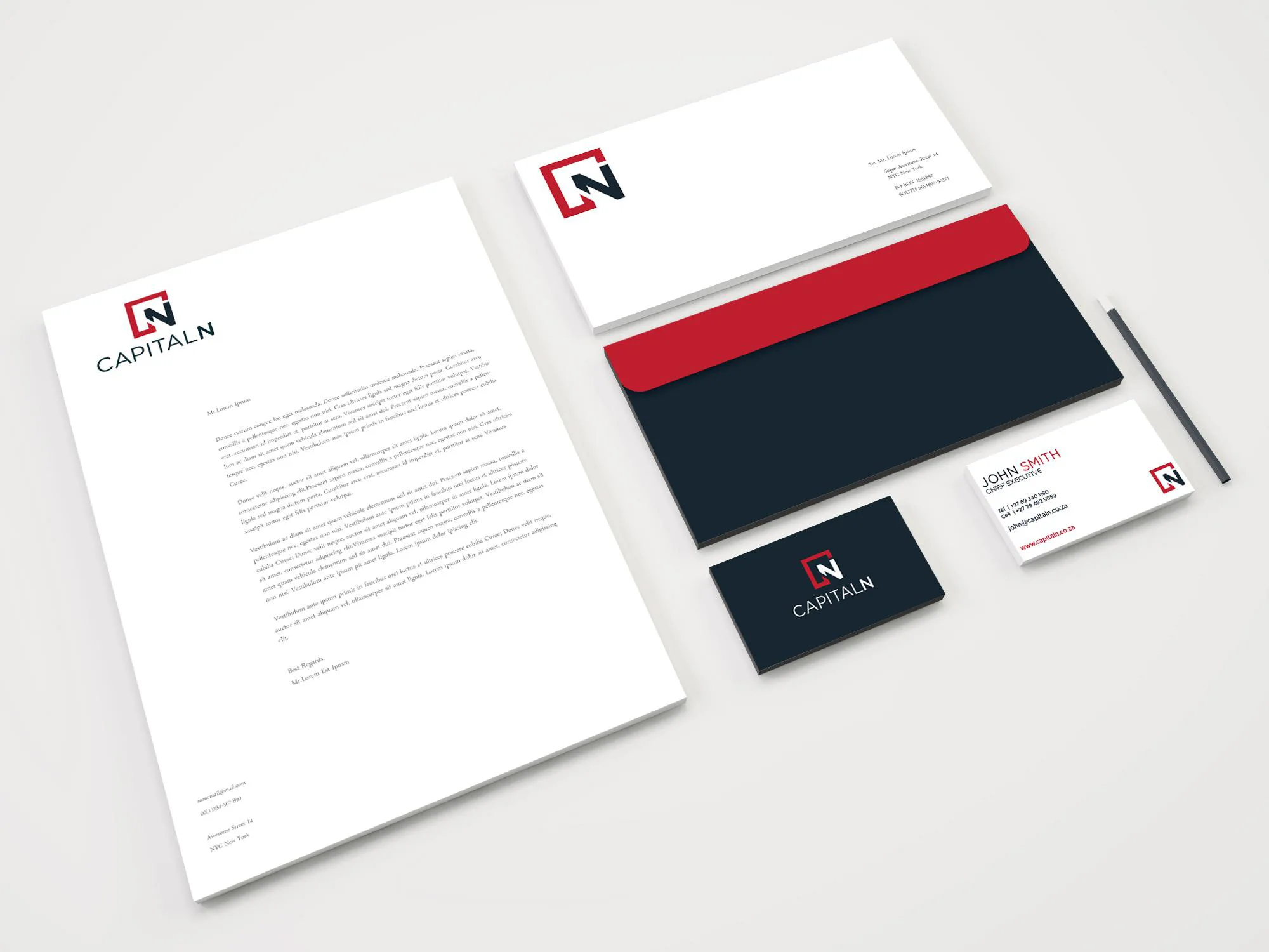
CapitalN
CapitalN provides cost-effective, end-to-end solutions that address Broad-based Black Economic Empowerment challenges in business. The brief was to develop a current, dynamic brand (logo) and included an up-to-date, professional website. Flow has also produced a range of branded collateral for this client.
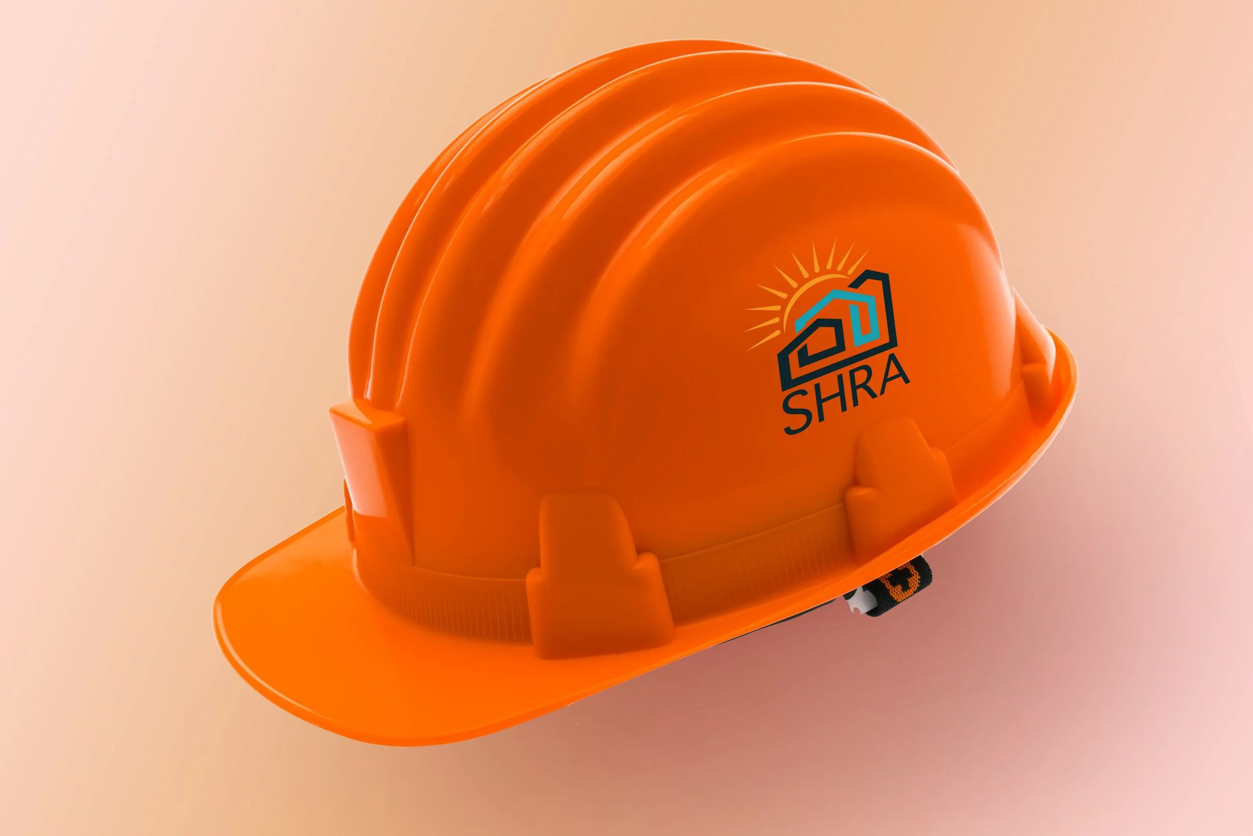
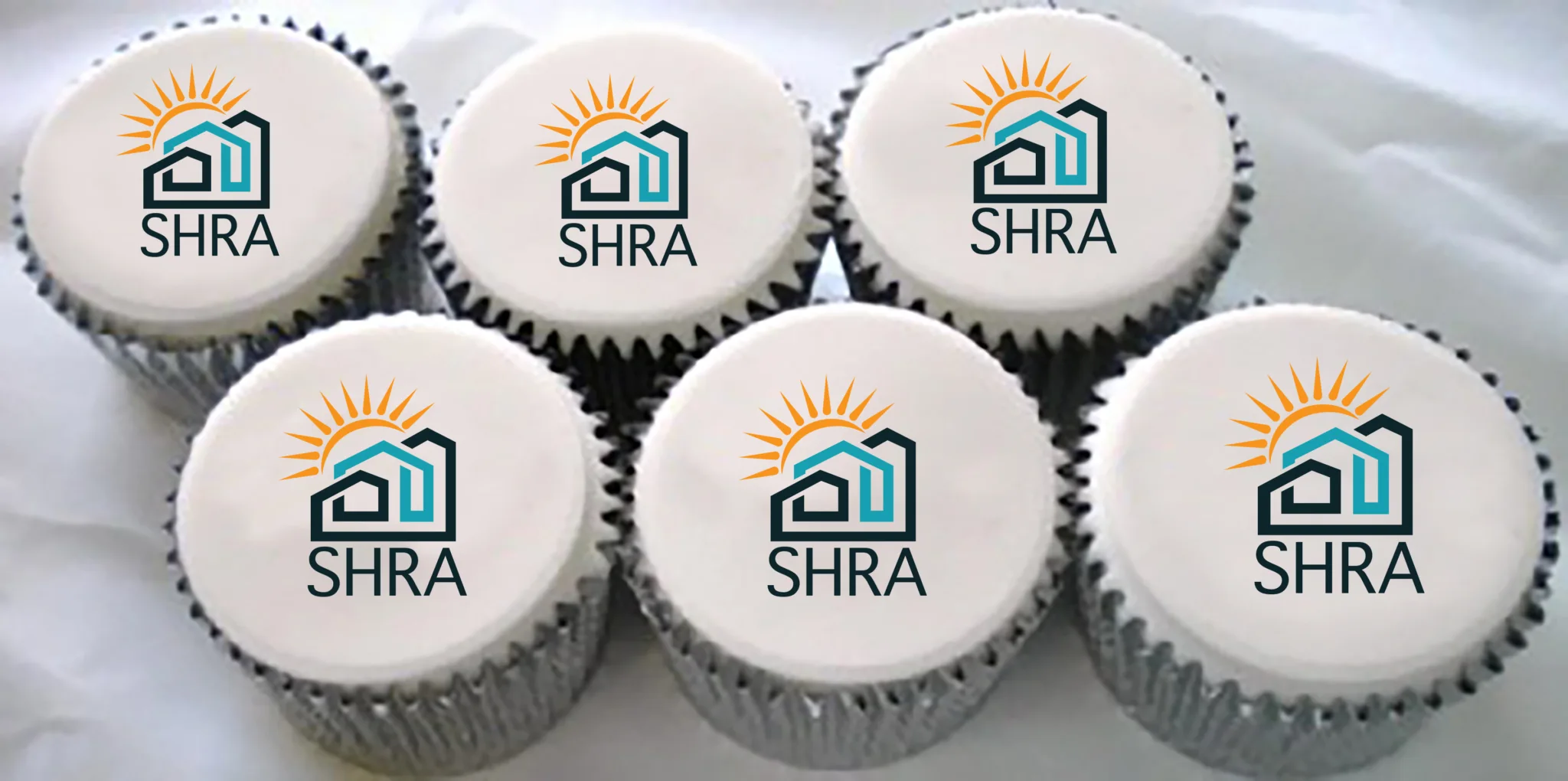
Social Housing Regulatory Authority (SHRA)
After working in tandem with a market research company commissioned to assess perceptions of the SHRA brand among stakeholders, it was concluded that a total rebrand was needed.
A dated, rather misunderstood logo was replaced with a more aspirational, fresh and modern identity that reflects what the Social Housing Regulatory Authority seeks to be known for.
To get staff buy-in, they were included in the logo development process and a simple launch event was held, during which a cake depicting the old logo was sliced up – and the new logo revealed on individual cupcakes.
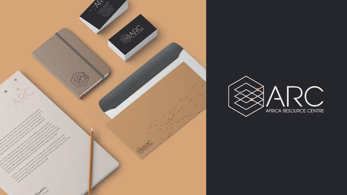
Africa Resource Centre (ARC)
The ARC is an independent strategic adviser that promotes collaboration to help countries achieve their healthcare goals. It approached Flow for help in creating a new brand identity.
We hosted a brand workshop and included stakeholders from across Africa to determine the way forward for the brand, and were then tasked with creating a visual identity and website. What ARC does is quite a difficult concept to represent in a logo, but the idea of connections and thought processes does come to life in the symbol. Simple animations on the website reinforce the brand message.
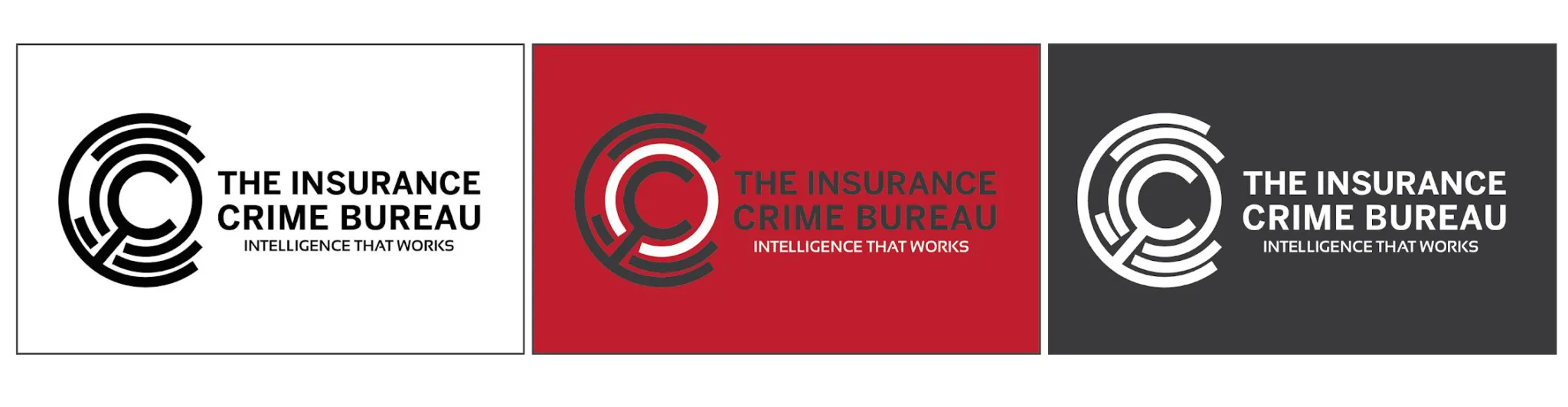
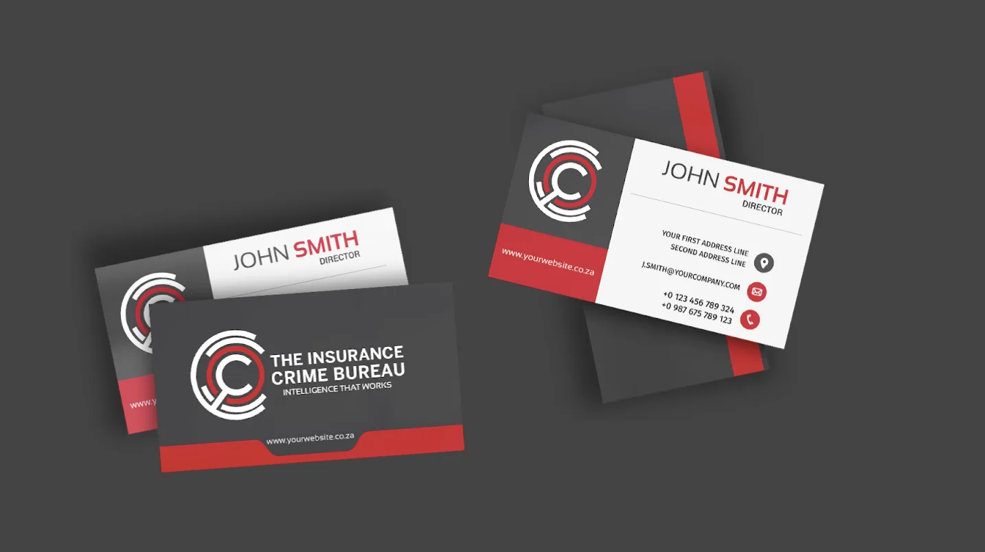
South African Insurance Crime Bureau (SAICB)
The SAICB approached Flow for strategic branding advice as it wasn’t getting the recognition or coverage for the good work it does in uncovering and combating insurance fraud.
A total overhaul and rebrand was suggested during the brand workshop, as the existing acronym had low recall and recognition. The proposal was to use the full name of The Insurance Crime Bureau, as this made the company’s purpose more self-evident.
The use of a magnifying glass in the logo helps to enunciate the investigative nature of the organisation, while the payoff line “Intelligence that works” clarifies its intention. The palette of red, black and grey was retained to have some reference to the old brand, as well as to indicate the serious nature of what the South African Insurance Crime Bureau does.
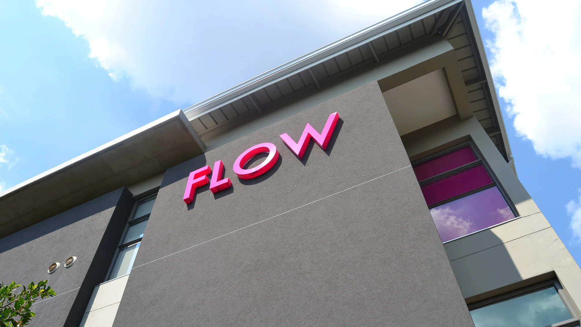
Flow Communications
Yes, it’s true, we also brand buildings! When next you spot our pink Flow logo at 2 Rosebank Road, Dunkeld, remember that we would love to develop a brand strategy for your organisation.