It’s Marketing 101 that every message a company sends out tells a deeper story of the brand behind it. Whether it is the website, logos, fonts or even the tone used on Twitter, everything builds the brand’s personality. Everything? When you look at a brand such as Flow, the strongest of these storytellers is generally our bright shade of pink. So what does pink say about Flow?
The field of colour psychology first started taking shape in the 1700s, when famous playwright Johan Goethe and dramatist Friedrich Schiller created the “rose of temperaments” colour wheel, matching 12 colours with human characteristics and occupations. Since then, colour psychology has followed a rocky path, considered something between an academic research topic and a mystical concept: logical enough to accept, but not scientific enough to take seriously. In the past 10 years, however, colour psychology has gained much interest, specifically on the internet and in marketing.
The question is whether colour can affect how people see brands, and if it actually drives consumers to prefer certain brands. This doesn’t quite relate to stereotypically linking the colour blue to calmness and yellow to excitement, but rather questioning the “personality” attributed to a brand through the colours associated with it.
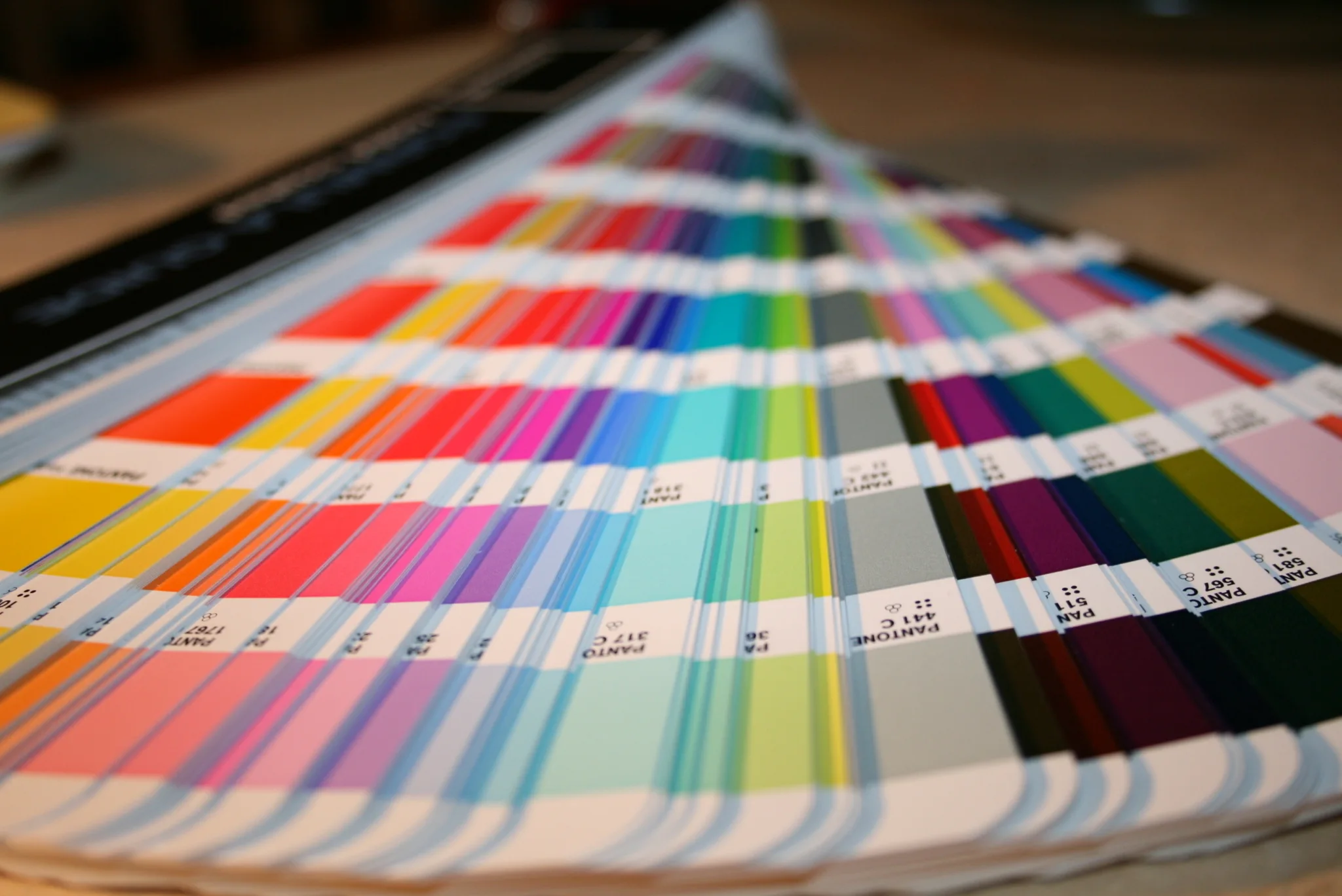
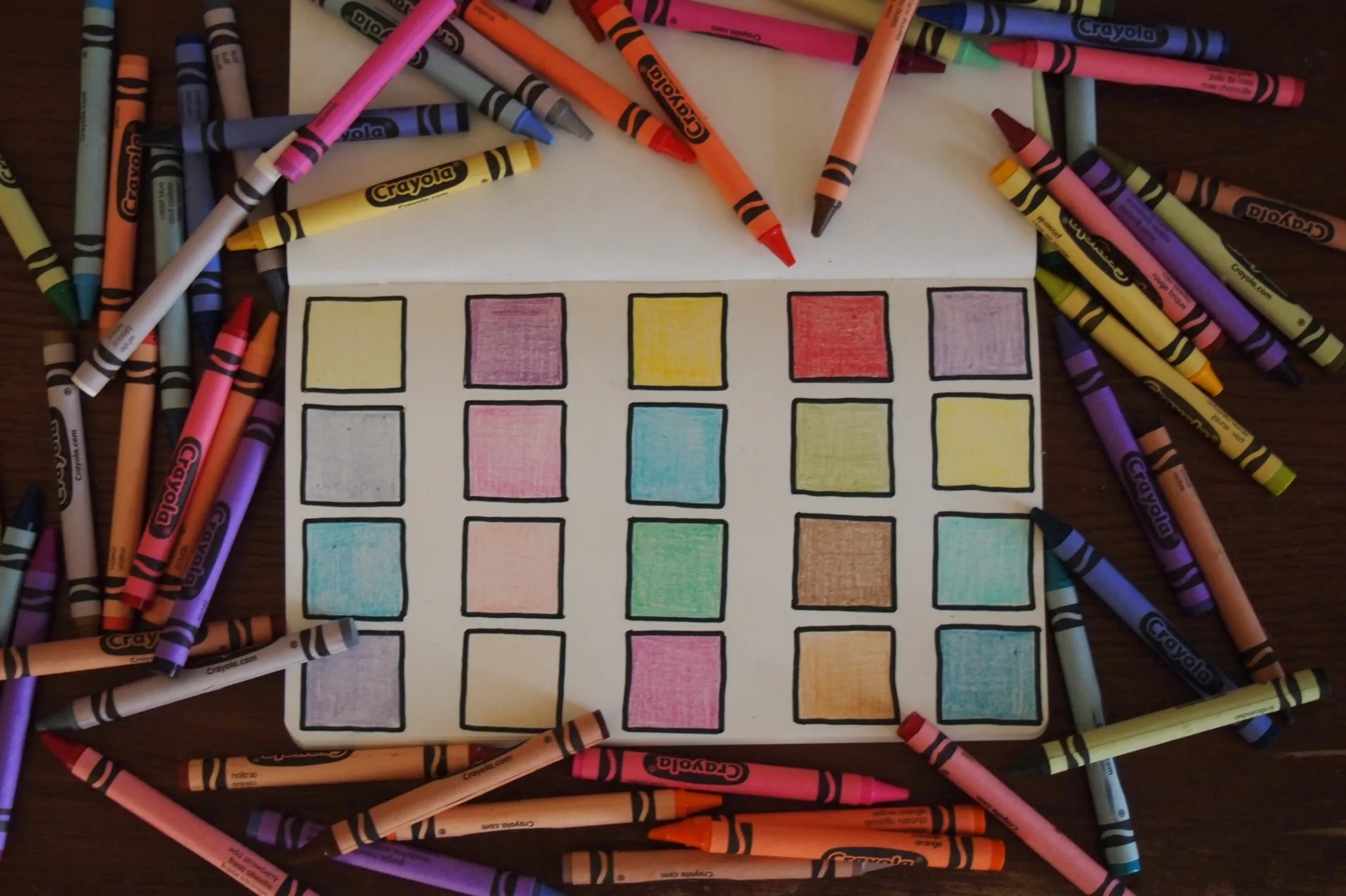
The difficulty with colour psychology is that personal and cultural preferences influence the effect colours have on people. Colour cannot be universally translated. In some cultures, white is used in weddings; in others, it is associated with funerals. In a groundbreaking study, researcher Satyendra Singh found that within 90 seconds up to 90% of judgements made about products are based on colour. So, if connotations to colour are not applicable to all, but still influence consumers, what can brands do to harness the power of colour?
In another study, Paul Bottomley and John Doyle found it isn’t the colour itself that affects people, it’s the appropriateness of the shade to the brand. For colour to influence a consumer, it needs to match the product, logo and name of the company, and therefore be aligned with the brand. Colour can thus help a brand build a personality, which in turn affects customers and consumers. Lauren Labrecque and George Milne found the right colour for a brand can build a certain mood or feeling associated with a product.
Apple uses colour effectively in this regard. More than simply using a white fruit to sell technology, the clean logo reflects the efficient design the multinational company is famous for – no unnecessary bells or whistles.
Similarly, Flow is known for creative solutions in a fast-moving space. A dull colour such as brown would hardly have been able to convey the message as effectively as a bright shade of pink, demanding interest and attention.
Using colour for marketing purposes is a fascinating and elusive field. Harnessing colour correctly can either build a beautiful brand or repel potential customers. The right hue can be the difference between cheap and luxurious, tacky or classy. Colour psychology isn’t science; it merely builds a personality about the story behind a brand.
So what does pink say about Flow? Have a look at our logo, name and website. What do you feel looking at our bright shade of pink? That’s where the magic of colour psychology lies.