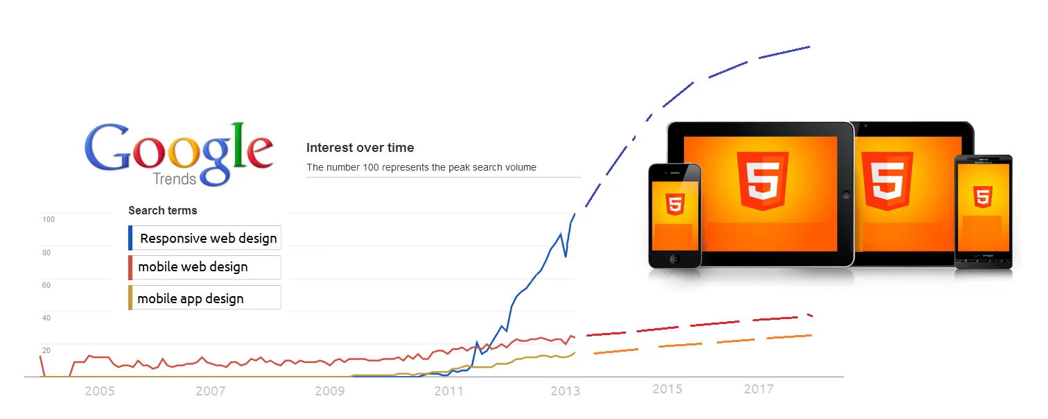
Over the past month, I’ve been working on the content for a brand-new website for the Table Mountain Aerial Cableway. The site incorporates responsive design, which means that it adapts to whatever screen size it is being viewed on to provide the best possible experience for the user.
“Every website we build is now responsive,” says Flow’s head developer, Richard Frank. “We don’t see it as an ‘add-on’ any more; it is now an intrinsic part of our development process.”
In his blogpost titled What you need to know about mobile for marketing your business, he outlines the shift in thinking that the programming studio has undergone in relation to mobile-friendly sites.
But of course, we don’t work in silos, and the shift towards responsive design affects all other aspects of a web project, especially us content creators. Having to think about what your copy looks like on three different screens, for example, can be quite a challenge. Here’s some of the learnings I’ve taken from this project:
Updating content is good feng shui
Just like spring-cleaning your home, updating and revising old website content makes everything look neater and tidier. Old stuff that you’ve been hanging onto “just in case” can finally be chucked, and what you’re left with is just the important bits. Duplicated content, wordy paragraphs and out-of-date copy can be revised and fixed before moving ahead with the project.
Shape your legacy
“Legacy” issues can creep in when moving from one system to another. Static pages, blogs and other plugins may look completely different on a new system. Be prepared to make necessary tweaks to old content that doesn’t sit comfortably on a new site, and allow an ample amount of time to address this.
Flow workflow works
A good workflow is essential when working on a responsive design. Close collaboration between content peeps and designers is required, since the website’s design informs the way content is set out. Conversely, content that we know users are after can be more expertly integrated into a responsive design.
“Responsive design highlights the need for teamwork,” says Flow designer Ryan Levenson. “The relationships between content, developer and designer need to be exceptional because as much as responsive websites have allowed for amazing things, they have also allowed for amazing obstacles along the way.
“With these obstacles, getting to the end product is more of an open discussion than a formulated process.”
One CMS to rule them all
If I told Sweet Brown that I needed to make a content change on three separate desktop, tablet and mobile websites, I think we all know what she’d say. But having one content management system pushing changes to one responsive website cuts down on the time it takes edit important site changes.
Karen McGrane, author of Content Strategy for Mobile, says the following: “Responsive design itself won’t fix your content – no one ever said it would. But the opportunity to implement a responsive redesign is also the opportunity to fix your content and its underlying strategy. It may seem more complicated to edit your content and fix your processes and systems at the same time you’re designing a new site – but in fact, pretending you don’t have to solve these problems just makes the job harder. Smart organisations will see this as a benefit, not a drawback, and will use this chance to make a better website, not just a squishy one.”
I am quite sure there will be plenty more learning experiences to be had as we continue to explore responsive design, and I look forward to making the most of this exciting new field.