
MalaMala (www.malamala.com) is the oldest (and one of the largest) private Big Five game reserves in South Africa, and is regarded by many as offering the ultimate luxury safari experience in Africa.
But an established brand occasionally needs a revamp to move with the times and continue attracting new converts to its charms, and this is where Flow Communications came in.
Since Flow came into existence in 2005, we have designed a large number of innovative logos, created corporate identities, branded company collateral and injected new life into dated brands.
When MalaMala reimagined its offering, renaming its camps and introducing a more contemporary edge to its décor, complete with earthy colours, this offered the perfect opportunity to also refresh its corporate identity, which had originally been established in the 1960s.
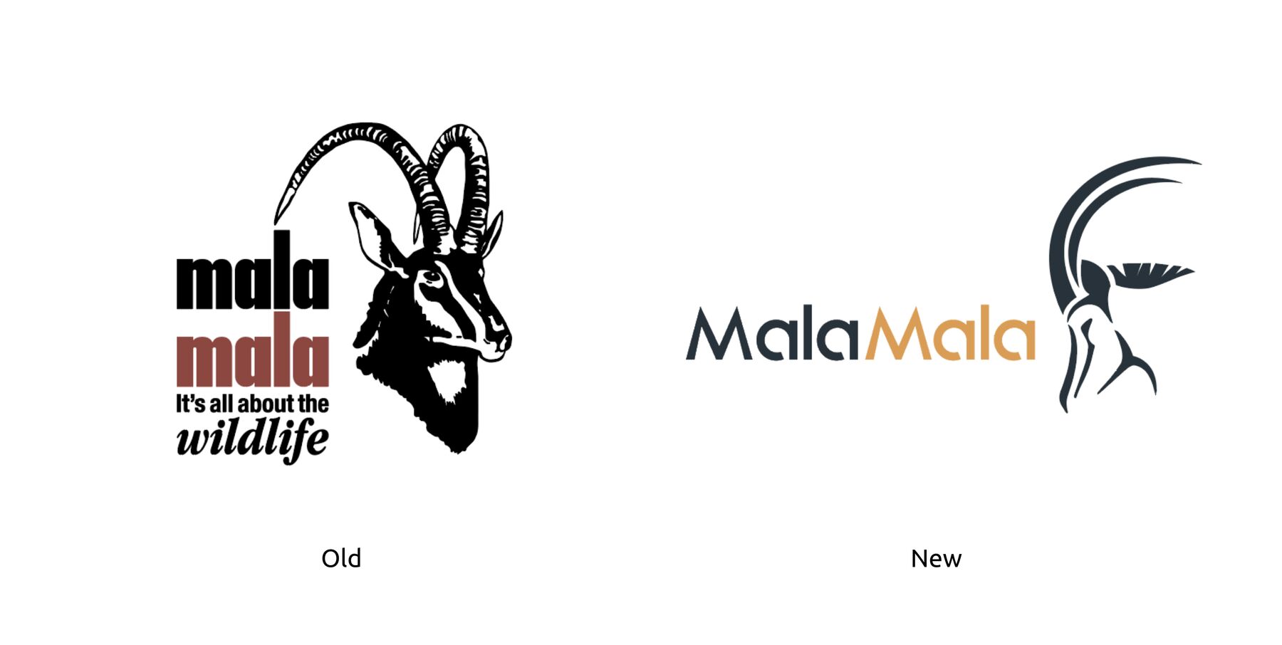
In response, Flow set about designing an engaging new identity and associated collateral for the game reserve, including signage, vehicle livery, website design, kids’ activity books, business cards and presentation templates. The result? A classy new logo and rebranding that stayed true to MalaMala’s passionately African DNA. As with the original design, the central icon is a sable antelope (“mhalamhala” in the Shangaan language of the area).
The brief
In 2018, the reimagination of the MalaMala Camp and Sable Camp presented a golden opportunity to refresh the MalaMala brand and logo at the same time.
MalaMala asked Flow to take into account the game reserve’s origins and long-standing reputation built up over almost a century, but also to weave in more contemporary elements to tie in with its revamped offering.
In other words, we had to balance the history and heritage of MalaMala with a more modern sensibility. The Flow strategy, branding and design teams set to work with enthusiasm on developing a new corporate identity for one of the agency’s favourite game reserves and the site of many a successful photo safari by Flow staff, intent on interrogating the brand and doing its reimagining justice.
Objectives/targets
To create a new brand identity and associated collateral for MalaMala
To enhance the brand’s visibility and attractiveness through the rebranding exercise
Strategy

Flow’s brand strategy is how we unpack and share the understanding and planning of a brand to build it better. It not only increases the voice and consumer awareness of a brand, but also gives it an identity and worth.
Before Flow can help fulfil a brand’s potential to evolve and succeed, we first need to assess and evaluate the existing brand, and guide the client in how to achieve the identified brand goals.
For MalaMala, we engaged in a workshop in which we unpacked the brand to discover the pivotal point between the brand and the business objective. By prioritising the identified consumers, we were able to craft a brand plan that will guide its internal and external communications.
Once we had developed a draft new logo, we travelled to the game reserve to show it to the team of people who work there, and then integrated their feedback into the final design.
Execution
In designing the new logo and identity for MalaMala, informed by the newly developed brand strategy, Flow considered two important points: that the name “MalaMala” was derived from the Shangaan word for the sable antelope (mhalamhala); and the fact that the iconic image of the sable head had been synonymous with MalaMala for more than 55 years.
MalaMala has always prided itself on being a distinctly African game reserve, and the burnt orange colour chosen as a primary brand colour not only embodies the earthy feel of MalaMala but also resembles the unique terracotta colours so evident throughout its camps.
It was therefore a natural fit to combine the stylised sable head imagery and this burnt-orange colour in the new MalaMala logo, keeping it simple and striking throughout all brand touchpoints.
The old logo looked dated with its old-fashioned font and the square shape of the original logo did not scale large or small for modern devices such as small cellphone screens or giant TVs. We therefore tweaked the original shape into a far more scalable rectangle.
Results

As with the reimagined MalaMala and Sable camps, the logo and new corporate identity developed by Flow successfully balances the history and heritage of MalaMala with a more contemporary look. It retains the soul and essence of the game reserve and evokes the bushveld safari feel that has made MalaMala so iconic and in demand among visitors from around the world.
The client was thrilled with the results and continues to use the refreshed and updated CI across all its platforms and marketing materials.